
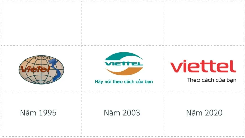
In early January 2021, Viettel Corporation surprised the public by unveiling its new brand identity. Many customers were taken aback as the familiar dominant colors of yellow and blue, which had been associated with Viettel for 16 years, were replaced with a vibrant shade of red. The legendary slogan “Hãy nói theo cách của bạn” (Speak your way) was also streamlined to emphasize that Viettel is no longer just a telecommunications company but has transformed into a digital service provider.
To delve deeper into the case of Viettel from a professional perspective on repositioning, Brands Vietnam has conducted an interview with Mr. Nguyen Hai Minh, CEO of Wisdom Agency. Beyond discussing changes in the logo or slogan, we will explore the underlying strategic layers and highlight the key takeaways that marketers can learn from this prominent event.
Deep Dive is a series of in-depth interviews that explores significant decisions, topics, and notable events in brand building, marketing, advertising, and communications.
Before discussing the details of Viettel’s case, could Mr. Minh please share with the readers which situations a brand needs to undergo repositioning?
Based on my consulting experience, I have noticed two common scenarios. Firstly, a business may need to change in order to grow stronger or address certain challenges. In such cases, the brand is compelled to make changes to meet the demands of a particular phase. Secondly, after a considerable period of development, typically around 3-5 years, a business may feel the need for something new. Refreshing the brand image becomes a viable option. Just like a set of clothes that becomes worn out and faded over time, we should acquire a new outfit, and the same applies to businesses.
People often perceive repositioning as simply changing the logo, while the underlying reasons for the change are often overlooked. Could you share your thoughts on such cases?
Based on my observations of brand repositioning activities worldwide, I have identified two main approaches: “Disruptive” and “Continuous”. The choice of approach depends on the brand’s objectives and the preferences of brand managers.
To explain the Disruptive approach, let’s take the fast-food industry as an example. When there was a growing movement to limit the use of meat-based products, fast-food chains had to reposition themselves as protein providers. This allowed them to introduce plant-based options into their product portfolios. In this case, the brand changed to participate in a broader playing field with more room for growth.
As for the Continuous approach, Google is one of my favorite examples. They have been changing their brand over the years, but the changes are often subtle and difficult to notice with the naked eye, sometimes involving just a few pixels in the logo. However, when you look back after a sufficiently long period of time, the changes become evident. This gradual approach helps keep the brand modern and relevant.
Returning to the case of Viettel, the company chose a complete transformation. From my observation, Viettel went through a significant period of development, expanding and becoming much more modern. However, the previous logo had also become outdated. Therefore, I believe that a comprehensive change to create a new identity for Viettel was an appropriate approach.
Indeed, like your saying, 16 years is a long enough time for a brand to undergo a revolution. However, Viettel’s customers are familiar with the green stores and the slogan “Hãy nói theo cách của bạn” (Speak your way), so a complete change may feel unfamiliar to them. What are your thoughts on this issue?
In my experience, if a business conducts market research on brand changes, the majority of customers would respond negatively. Even after the new brand is launched, they may still say, “I feel something is wrong with this.” Vietcombank also underwent a complete rebranding. Personally, I think the new logo is an improvement, replacing the intertwined VCB letters that were somewhat confusing in the old logo. But at the time of the launch, customers still gave a lot of negative feedback.
To explain this phenomenon, humans tend to be nostalgic. We prefer the safety of things that are familiar and old. So when they are replaced, our subconscious reaction is resistance.
The same applies to Viettel. The initial public reaction was that the old green color was more suitable for a military company like Viettel, and they didn’t see the relevance of the red color. From a professional perspective, I see the choice of a solid red color for the new brand identity as having its merits, but it also presents certain challenges.
The merit is that Viettel probably realized they couldn’t rely on an image associated with the military to move towards the future. Switching to a dominant red color, the color of the Vietnamese flag, helps them represent something grand and appropriate for reaching further. However, the challenge is that there are already many brands that dominate public consciousness with their characteristic red color, such as Coca-Cola or JUNO. When people think of red, Viettel is certainly not the first brand that comes to mind. They will need to make significant efforts to make customers familiar with the new color.
- Setting aside the appropriate issue for now, what do you think if Viettel has an intermediate transition phase of about 2-3 years to link the old green color with the red color before fully using the red color in the later stage?
I believe that a gradual transition is not the optimal choice for Viettel. Unlike companies operating entirely on a digital platform that can quickly change everything synchronously, Viettel faces many difficulties of its own. Changing the entire system of billboards and stores to be synchronized would incur a significant cost, not to mention the time it would take.
The rebranding story of Hoa Phat Group is a testament to this. As far as I remember, they set a deadline of 6 months to achieve uniformity in the entire system and nationwide distribution network, but the implementation time actually took more than 1 year.
- The slogan “Hãy nói theo cách của bạn” (Speak your way) has also been simplified to “Theo cách của bạn” (Your way). It is a bold change, as if “Viettel” has become a new verb replacing the word “Speak” in the old slogan. Could this be an effective verbal expression for their new positioning?
The new slogan “Theo cách của bạn” (Your way) has the advantage of preserving the essence of Viettel by simply condensing the previous slogan. At the same time, it conveys an implicit message or brand promise that Viettel will do everything to make life happen the way customers want. Through this expression, I see a certain connection between the slogan and the future plans they have shared, such as building a data platform and learning consumer behavior to provide better services.
However, personally, when I hear the phrase “Theo cách của bạn” (Your way), especially in the English version “Your way,” it naturally reminds me of the Burger King brand. Because the classic slogan of the fast-food chain is “Have it your way.” It seems that Viettel will need a clever communication approach to differentiate itself, as their new slogan is not too specific and can be easily confused with other brands.
The question remains whether Viettel is ambitious enough to turn its brand name into a verb, similar to Google and Grab. Let’s wait and observe their communication activities in the near future. Because if Viettel has carefully considered that, then they will definitely implement it.
- When it comes to rebranding, we cannot ignore the logo, the most visual and recognizable element, but sometimes the design language is difficult to fully convey the mission and strategic meaning behind it. What is your opinion on Viettel’s new logo design?
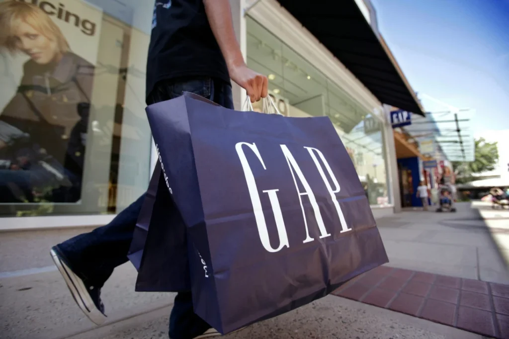
Indeed, there have been many cases in the world where design language fails to capture the intended message that the brand wants to convey, leading to harmful consequences, as in the case of the fashion brand GAP. They spent a considerable amount on logo redesign, around tens of millions of dollars. But after receiving criticism from customers, GAP reverted to using the old logo within just 7 days.
To explain, I would like to share about the 5 elements that make up the brand experience. They include: Look, Talk, Do, Feel, and finally, Dream. The first four elements are relatively easy to understand, so I will further explain the fifth element. The ultimate thing customers desire and aspire to when using a brand is to become a better or more useful entity for society, which is the Dream.
From this, it is easy to see that the Look is just an initial factor, so it is difficult for it to fully express the intentions related to the brand strategy. They can only be fully interpreted through the combination of all 5 elements. Furthermore, current brands tend to simplify their design. We can see that Viettel’s new logo is much simpler than before, with the only highlight being the speech bubble on the letter “i,” so the layers of meaning in the old logo have been refined and filtered down to a few key points.
- Viettel has shared that they are repositioning themselves to expand their product portfolio targeting a more dynamic audience, which can be understood as both young users and young businesses. In your opinion, will the rebranding with the dominant red color be effective in rejuvenating the brand?
Changes in brand identity often have the strongest impact on end users, in this case, young users. As for B2B transactions, partnership decisions are usually based on trust in the relationship, so the identity factor will not have much influence.
Regarding the rejuvenation of a brand, I believe it is necessary to do so after a certain period of development, typically ranging from 5 to 20 years. Firstly, just like individuals, a brand does not want to be seen as outdated and slow-moving. We all desire to appear youthful and dynamic in the eyes of others. Secondly, the target audience that holds the economic power of the entire country is the younger generation. They have significant consumer needs and influence. In order to appeal to them, Viettel needs to continuously update itself to keep up with the trends, and this is evident.
In summary, what we are currently witnessing with Viettel is simply a change in the visual aspect (look), which is a preliminary factor in the brand experience model that I mentioned earlier. To make the best evaluation, we need to wait and see how Viettel communicates and delivers services in the upcoming phase, with a focus on the most important aspect, which is the dream that Viettel brings.
Here are some key takeaways from the discussion:
- Viettel chose a comprehensive and sudden change approach, rather than a gradual transition.
- Considering the cost of changing all signage and store systems, a complete transformation in one go is a more reasonable choice than a gradual shift.
- Evaluating a repositioning strategy should not only focus on the surface level, such as the visual aspect, but also consider other elements like communication language (talk), brand actions (do), emotional appeal (feel), and most importantly, the brand’s dream.
Sometimes there can be a mismatch between design language and customer expectations, but we need to consider the overall campaign, including communication efforts and the various experiences created.